Dashboard
The Dashboard is the first screen you see after signing in to Allegro. It's a near-real-time view of how readers are engaging with your content, how your audience is growing, and how your content library is performing — so you can spot trends without digging through lists or reports. A Live badge next to the title shows the page is updating on its own.
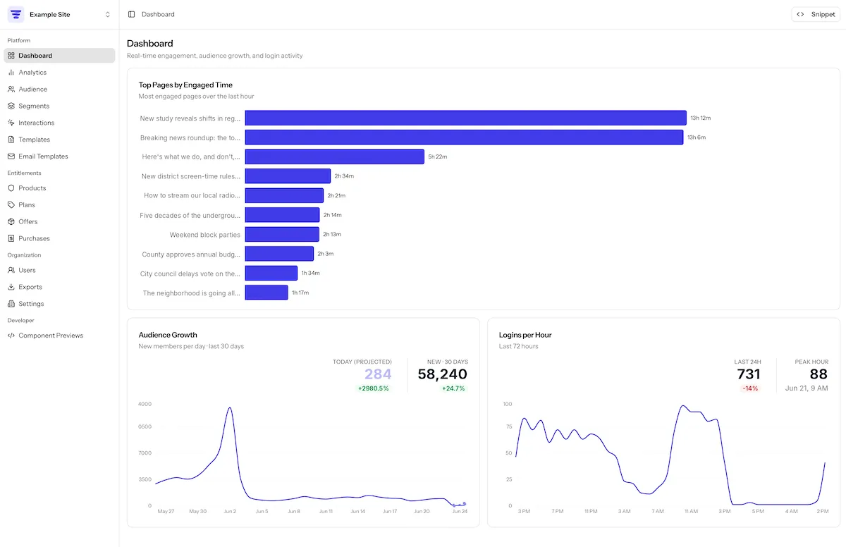
The page refreshes on its own while it's open, so you never need to reload. Each section loads independently, and the page appears immediately with placeholder skeletons while the numbers fill in — a slow analytics query never holds up the rest of the page.
| Section | Refreshes about every |
|---|---|
| Top Content by Engaged Time | 20 seconds |
| KPIs, Audience Growth, Logins per Hour, Performance by Section | 5 minutes |
Use the Snippet button in the top-right corner at any time to view the embed code for adding Allegro to your site.
KPIs
A strip of four headline tiles sits at the top of the Dashboard, each showing a single number, a colored change indicator comparing it to the previous period, and a small trend sparkline of recent days.
| Tile | Meaning | Window |
|---|---|---|
| Active Members | Members active in the period, compared with the previous 30 days. | Last 30 days |
| New Members · 30D | New members who joined, with a trend indicator. | Last 30 days |
| Avg Engaged Time | Average engaged time per page view, with a trend indicator. | Last 30 days |
| Logins · 24H | Total member logins, compared with the previous 24 hours. | Last 24 hours |
Active Members and New Members are drawn from your member records, so they're always available. Average Engaged Time and Logins are powered by Allegro's analytics backend; when that data isn't available, the tile shows a dash (—) instead of a number.
Audience Growth
The Audience Growth card plots how many new members joined over time, so you can see whether sign-ups are trending up or down.
- Each bar is one time bucket, and the busiest bucket in the window is highlighted.
- The bar for the current period is shown as a projection (in a muted tone). Because the period is still in progress, this projection estimates where it's on track to land based on the pace so far and your recent average — so a young day reads as "on track to" rather than a sudden drop.
- Hover any bar to see its date and count; the current bucket also shows how many members have joined so far.
Use the Daily / Weekly / Monthly toggle in the top-right to change the granularity. Daily covers the last 30 days, Weekly the last 12 weeks, and Monthly the last 12 months.
A row of headline figures sits above the chart and follows the granularity you pick:
| Stat | Meaning |
|---|---|
| Today (projected) | The estimated total new members for the current period, with a trend indicator. |
| New · 30 days | Total new members over the window, with a trend indicator. |
| Avg per day / week / month | The average per bucket for the chosen granularity. |
| Best day / week / month | The single busiest bucket, with the date it occurred. |
"Today" follows your organization's configured time zone, so the day rolls over at local midnight rather than UTC.
Audience Growth is drawn from your member records directly, so it stays available regardless of the analytics backend.
Logins per Hour
The Logins per Hour card charts member logins over the last 72 hours, grouped into two-hour buckets, so you can see daily rhythms and the impact of a campaign or send. The busiest buckets are drawn in a stronger color.
Two headline figures sit above the chart:
| Stat | Meaning |
|---|---|
| Last 24h | Total logins in the last 24 hours, with an indicator comparing it to the previous 24 hours. |
| Peak hour | The single busiest bucket in the window, with its login count and the time it occurred. |
Hover a bar to see its time range, its total logins, and a breakdown by login method (such as Email, Google, Apple, Facebook, or Magic link). Hour labels and the peak-hour time are shown in your organization's time zone.
Top Content by Engaged Time
The Top Content card ranks the pages your readers are spending the most engaged time on over the last 24 hours. Engaged time counts only the time a page is actually open and active in front of a reader, not time spent in a background tab. This is the most live part of the Dashboard and refreshes about every 20 seconds, so you can watch engagement shift as a new article picks up readers.
Each row shows:
- A thumbnail and the page title, with a meta line of section, author, and publish date when Allegro has that page in its content catalog (otherwise the page's path). Pages the catalog marks as evergreen carry an Evergreen badge.
- A Share of engaged time bar showing how much of the total the page accounts for.
- Engaged (total engaged time), Views, and Avg (average engaged time per view).
Click a row to open that page in a new tab.
Use the section pills at the top of the card to filter to a single section, or All content to clear the filter. The subtitle shows how many pages are indexed, and a count shows how many of them the table is currently showing.
If no engagement has been recorded in the last 24 hours yet, the card says
No engagement recorded in this window yet.
Performance by Section
The Performance by Section card rolls your indexed pages up by section over the last 30 days, so you can compare how whole areas of your site are performing rather than individual pages.
| Column | Meaning |
|---|---|
| Section | The content section. |
| Pages | Number of indexed pages in the section. |
| Views | Total views across the section. |
| Engaged Time | Total engaged time across the section. |
| Avg Engaged | Average engaged time per page. |
| 30-Day Trend | A sparkline and change indicator for the section over the window. |
The numeric cells are shaded from light to dark to show low-to-high values at a
glance — a Low … High key sits above the table. If no section data has been
recorded in the window yet, the card says
No section data recorded in this window yet.
When data is unavailable
Top Content, Performance by Section, Logins per Hour, and the Average Engaged
Time and Logins KPI tiles are powered by Allegro's analytics backend. If that
backend is temporarily unreachable, those cards show
Analytics data is temporarily unavailable. (and the affected KPI tiles show a
dash), then recover automatically once it's back. Each section degrades on its
own, so the rest of the Dashboard keeps working. Audience Growth and the Active
Members and New Members KPI tiles are drawn from your member records directly,
so they stay available regardless.