Branding
Branding is where you give the Allegro components on your site your own visual identity — your logo, colors, fonts, and shape — without writing any CSS. You set a small number of global design tokens once, and every embedded component (login forms, email forms, content gates) inherits them automatically. When you need finer control, you can override a single detail on a single component without disturbing the rest.
Go to Organization Settings → Branding to open the editor. Branding is an organization-wide setting, so it is available to administrators.
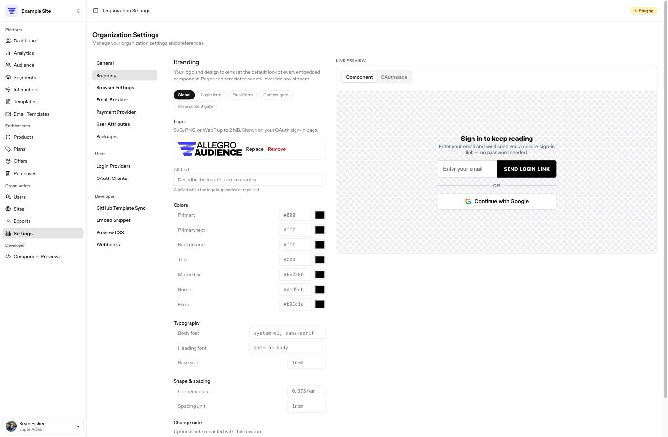
How the design system works
Allegro's branding is built as a small design system: a layered set of variables where broad, brand-wide choices flow down into the specific pieces of each component. There are three levels, from most general to most specific:
| Level | What it is | Example |
|---|---|---|
| Global design tokens | A handful of brand-wide defaults — your primary color, body font, corner radius, etc. | Primary color = your brand teal |
| Component-specific variables | Individual settings exposed by each component, grouped by the part they affect. | Login form → Submit button → Background |
| Built-in defaults | The values a component ships with, used when you haven't set anything. | Black button on a white background |
The key idea is inheritance. Most component-specific variables don't have a value of their own until you give them one — instead they inherit from a global token. So when you change a global token, every component that inherits it updates at once. You only reach for a component-specific override when you want one spot to differ from the brand-wide default.
Everything in branding is optional. Until you change something, components render with their built-in defaults, exactly as they did before you set up branding. There's no need to fill in every field.
The inheritance chain
When a component renders, each of its settings resolves in this order and uses the first value it finds:
- A component-specific override you set (for example, the login form's submit-button background).
- Otherwise, the global token that setting inherits (for example, your Primary color).
- Otherwise, the component's built-in default.
This is why setting a single global token can restyle several components at once, and why an override only ever affects the one place you set it.
The editor at a glance
The Branding editor has two columns:
- Controls on the left, where you edit tokens and overrides.
- A live preview on the right that re-renders the real components with your in-progress changes, so you can see the effect before saving.
At the top of the controls is a scope switcher that decides what you're editing:
| Scope | What you edit |
|---|---|
| Global | Your logo and the global design tokens (colors, fonts, shape). |
| Login form | Per-part variables for the allegro-login-form component. |
| Email form | Per-part variables for the allegro-email-form component. |
| Form | Per-part variables for the allegro-form component. |
| Content gate | Per-part variables for the allegro-content-gate component. |
| Inline content gate | Per-part variables for the allegro-content-gate-inline component. |
| OAuth page | The full look of your hosted sign-in and error pages. |
A small dot next to a field indicates it has been changed from its default.
Global design tokens
Switch to the Global scope to edit the brand-wide tokens. These are the defaults that flow into every component through inheritance. They are grouped into Colors, Typography, and Shape & spacing.
Colors
| Token | Default | What it controls |
|---|---|---|
| Primary | #000 | Your main brand color — buttons, focus states, accents. |
| Primary text | #fff | Text and icons that sit on top of the primary color (e.g. button labels). |
| Background | #fff | Component and input backgrounds. |
| Text | #000 | Default body text color. |
| Muted text | #6b7280 | Secondary text — hints, dividers, help copy. |
| Border | #d1d5db | Input and container borders. |
| Error | #b91c1c | Validation errors and error messages. |
Each color has both a hex text field and a color picker.
Typography
| Token | Default | What it controls |
|---|---|---|
| Body font | system-ui, sans-serif | The default font family for component text. |
| Heading font | (same as body) | The font family for headings; falls back to the body font. |
| Base size | 1rem | The base font size components scale from. |
Font fields accept any valid CSS font-family value (for example,
Georgia, serif). As you type, a list of common font suggestions appears — the
suggestions are a convenience, not a limit, so you can enter any font your site
already loads.
Branding does not host or load web fonts for you. Enter fonts that are already available on the pages where your components appear.
Shape & spacing
| Token | Default | What it controls |
|---|---|---|
| Corner radius | 0.375rem | How rounded buttons, inputs, and containers are. |
| Spacing unit | 1rem | The base spacing components use for gaps and padding. |
Component-specific variables
Switch the scope to a component (for example, Login form) to fine-tune its individual parts. Variables are organized into collapsible groups by the part of the component they affect — the login form, for instance, groups its variables into General, Email input, Submit button, One-time code, Social buttons, Divider, Errors, State screens, Resend link, and Loading & disabled.
Each group header shows either how many variables it contains or, once you've customized some, how many are overridden. A filter box at the top of the scope lets you search variables by name.
Inheriting vs. overriding
Every component variable is in one of two states:
- Inheriting — the default. The row shows a label like Inherits Primary, meaning it takes its value from that global token. You don't have to do anything; if you change the global token later, this variable follows along.
- Overridden — you clicked Override and gave it a specific value. It now ignores the global token for this one spot. Click Reset to return it to inheriting.
When you click Override, the field is pre-filled with the value it was already inheriting, so you start from what's currently showing rather than from a blank field.
Not every variable inherits a global token. Structural, one-off settings (such as a button's padding or letter-spacing) show Component default instead of an "Inherits" label — there's no brand-wide token that would make sense for them, so they simply use the component's built-in value until you override them.
A worked example
Suppose you set the global Primary color to your brand's teal. Because they all inherit Primary by default, the following update at once:
- the login form's Submit button background,
- the email form's Button background, and
- the content gate's action Button background.
Now suppose you want the email form's button to be a slightly darker teal than everything else. Switch to the Email form scope, open the Button group, click Override on Background, and enter the darker value. Only the email form button changes — the login form and content gate buttons still follow the global Primary token.
This is the whole point of the cascade: broad changes are one edit, and exceptions stay local.
If you want a brand-wide change, edit a global token — not each component. Reach for a component override only when one specific spot needs to differ.
The components you can brand
| Scope | Component | Where it appears |
|---|---|---|
| Login form | <allegro-login-form> | Member sign-in, including one-time codes and social buttons. |
| Email form | <allegro-email-form> | Email capture / newsletter sign-up. |
| Form | <allegro-form> | Admin-composed profile forms members fill out. |
| Content gate | <allegro-content-gate> | The modal gate that blocks content until a member acts. |
| Inline content gate | <allegro-content-gate-inline> | The inline (non-modal) variant of the content gate. |
For the full list of variables each component exposes, see the developer Web Components reference.
The OAuth page
The OAuth page scope is different from the four above: it brands a page rather than a component. Your hosted sign-in page (and its error page) lives on your Allegro domain, so there is no host site whose CSS your developers can adjust. Everything about how that page looks is therefore controlled here.
The scope is organized into seven groups:
| Group | What it controls |
|---|---|
| Page | Page background, font family, base font size, and the two text colors. |
| Panel | The card the form sits in: background, border color and width, corner radius, padding, max width, and shadow. |
| Logo | Maximum height of your logo and the space beneath it. |
| Continue button | Background, text color, corner radius, padding, font size, weight, and text transform. |
| Secondary link | The "Use a different account" link: color, hover color, and font size. |
| Header text | Text color, font family, font size, and link color for your header copy. |
| Footer text | The same four controls for your footer copy. |
The Header text and Footer text groups control only how that copy looks. The words themselves live in Organization Settings › Sign-in page, because they are content rather than design. See Sign-in page.
Every variable falls back to the matching global token, so a page you never touch still follows your brand. Two are worth calling out:
- Page background does not inherit the global Background token. That token is the panel's surface, so sharing it would flatten the panel into the page. Page background defaults to a light grey instead.
- The sign-in form inside the page is styled by the Login form scope, not this one.
Logo
In the Global scope, upload your logo from the Logo field.
- Accepted formats: SVG, PNG, WebP, or JPEG, up to 2 MB.
- Add Alt text describing the logo for screen readers. Alt text is applied when the logo is uploaded or replaced.
- Once a logo is set, use Replace to swap it or Remove to clear it.
Your logo appears on your organization's hosted OAuth sign-in page (and the matching error page), and is made available to the SDK for use in templates.
Uploaded SVG files are sanitized on the server — scripts and remote references are stripped — so an SVG logo is safe to display.
Live preview
The preview panel on the right renders the actual components with your in-progress values, updating as you type. It follows the scope switcher, so selecting Login form previews the login form, and so on. The Global scope also previews a representative sign-in card so you can judge your tokens against a realistic layout. Nothing in the preview is saved until you click Save.
Two scopes offer extra preview controls:
- Content gate lets you switch the gate between its bottom and center positions.
- OAuth page lets you switch between the three states the page can be in: the sign-in form, the continue as prompt shown to a member who is already signed in, and the error page. The preview uses the same stylesheet the real page uses, so what you see is what gets served.
Saving and revisions
Click Save to publish your branding. You can add an optional Change note describing what changed; it's recorded with the revision.
Every save creates a revision. Open the Version History panel (from the button beside Save) to:
- Browse past revisions, with the author and time of each.
- Compare a revision against the one before it to see exactly what changed.
- Roll back to any earlier revision in one click, which immediately restores that version everywhere.
Where branding appears
Your branding is applied to the Allegro components embedded on your own site, and to your hosted OAuth sign-in and error pages. It is delivered as a small stylesheet that is cached for performance, so a change may take a few minutes to appear on live pages.
Crucially, branding only sets defaults. Your site's own stylesheet, and any CSS inside an interaction template, always takes precedence over branding — so branding will never fight with, or override, the styles you ship yourself. A tenant that hasn't set any branding is served nothing extra at all.
Per-property branding
If your organization runs multiple properties, each property can override this organization-wide branding with its own logo, tokens, and component variables. Overrides are per value: anything a property leaves unset inherits the organization's branding, so a change you make here still flows through to every property automatically unless that property has overridden the specific value. Each property serves its own merged stylesheet on its own web address.
See Properties → Branding for how to edit a property's branding.
Related Links
- Settings — other organization-wide configuration
- Properties — override branding per property
- Permissions — who can edit organization settings
- Web Components — the full CSS variable reference for each component